Opening Scene
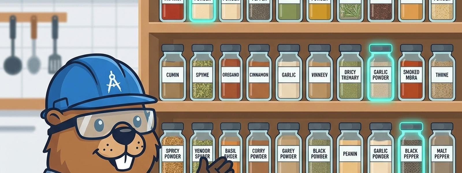
Open a poorly organized pantry and you might find three half-used jars of cinnamon, two of them expired, one mislabeled as nutmeg. Open a well-organized one, and there’s exactly one jar per ingredient, clearly labeled, always in the same spot. The well-organized pantry isn’t just tidier — it’s more trustworthy. You never have to wonder which jar is the “real” one.
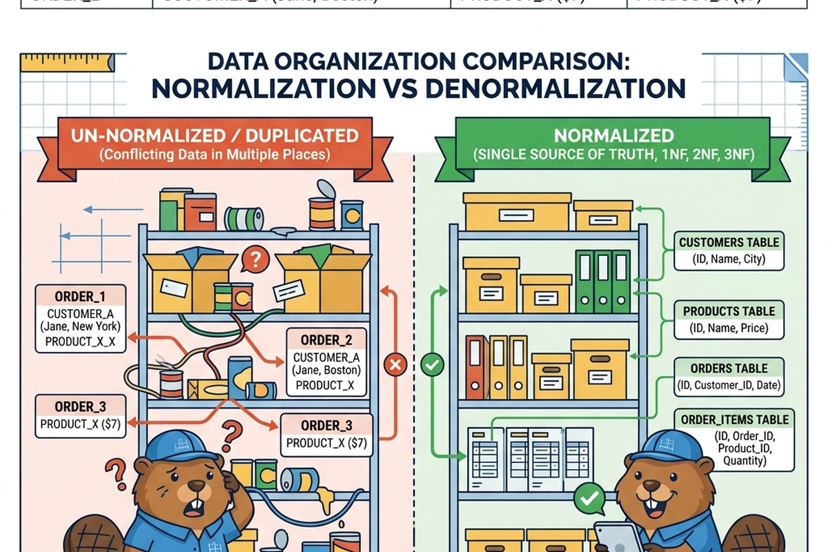
Data has the same problem. When the same fact is stored in more than one place, those copies inevitably start to disagree, and nobody can be sure which one is right.
In Plain English
Normalization is the practice of organizing a data model so that each fact lives in exactly one place, reducing duplication and the contradictions that come with it. Denormalization is the deliberate choice to allow some duplication anyway, usually to make reading data faster or simpler — accepting a trade-off rather than making a mistake.
The Old Way
Traditionally, normalization was treated as a strict discipline, often broken into formal “levels” (first, second, third normal form, and beyond) that database designers were trained to follow step by step. The goal was to eliminate redundancy almost entirely: a customer’s address would be stored once, in one table, and every order would simply reference that customer rather than repeating their address each time.
This produced clean, consistent, trustworthy databases — but also ones that could be slow or cumbersome for certain kinds of reading, especially for analytics and reporting. To get useful read performance for dashboards and reports, teams would deliberately introduce some denormalization, the data equivalent of keeping a small, duplicate “everyday spice jar” by the stove for convenience, even though the “real” labeled jar lives in the pantry. Done carefully, this was an intentional trade-off. Done carelessly across a large legacy system, it became dozens of slightly different “addresses” for the same customer, no one agreeing on which was current.
What’s Changing (and Why AI Is the Reason)
- Finding hidden duplication at scale is now realistic. In a large, messy system with hundreds of tables, manually auditing for redundant or inconsistent data used to be slow, tedious detective work. AI tools can now scan large datasets and flag likely duplicate “jars” — fields that seem to represent the same fact stored in multiple places — far faster than a human reviewer working table by table.
- Inconsistency detection is becoming proactive instead of reactive. Rather than discovering that two “address” fields disagree only after a customer complaint or a failed report, AI-assisted data quality tools can continuously compare duplicated fields and flag drift as it happens, the way a smart pantry might notice you’ve got mismatched cinnamon jars before you reach for the wrong one.
- Denormalization decisions are becoming more deliberate and reversible. Because AI tools can model the performance trade-offs of normalizing vs. denormalizing a given structure, and can help regenerate denormalized “convenience” views automatically from a single normalized source, teams can treat denormalization as a flexible, on-demand convenience layer rather than a one-way decision baked permanently into the database.
The Metaphor, Fully Extended
| Pantry Element | Data Modelling Concept |
|---|---|
| One labeled jar per ingredient | A normalized data structure (one source of truth per fact) |
| Duplicate, mismatched jars of the same spice | Redundant, inconsistent data across tables |
| A meal-kit with pre-portioned, overlapping ingredients | A denormalized structure, duplicated deliberately for convenience |
| The pantry’s master inventory list | The normalized “source of truth” table |
| The small everyday spice jar kept by the stove | A denormalized field kept for fast, convenient reading |
| Checking expiry dates across jars | Auditing for stale or inconsistent duplicated data |
| A pantry organizer doing a full manual audit | A data architect manually identifying redundant fields |
| A smart pantry sensor flagging mismatched labels | AI tools detecting duplicated or inconsistent data automatically |
| Deciding which jars are worth duplicating for convenience | Deliberately choosing where denormalization is worth the trade-off |
| Restocking the everyday jar from the master jar | Regenerating a denormalized view from its normalized source |
For Beginners: What to Actually Do
- Practice spotting duplication in any spreadsheet or table you encounter: is the same fact (like a customer’s email) appearing in more than one place? If so, ask which copy is the “real” one.
- Don’t assume normalization is always “more correct” — learn to recognize when a little duplication is a deliberate, reasonable trade-off for speed or simplicity, not a mistake.
- When an AI tool flags a possible duplicate field, take the time to manually check a few examples before deciding whether it’s truly redundant or intentionally denormalized.
- Get comfortable with the basic idea behind normal forms even if you don’t memorize their formal names — the core idea is simply “each fact, one home.”
For Practitioners and Leaders: The Deeper Layer
- AI-assisted duplication detection is excellent at surfacing candidates, but distinguishing “accidental redundancy” from “intentional, documented denormalization” still requires human business context — make sure findings are triaged by someone who understands why a structure was built the way it was, not auto-corrected.
- Treat AI-assisted drift detection between duplicated fields as an opportunity to formalize denormalization as a managed, regenerable layer (e.g., materialized views refreshed from a normalized source) rather than as scattered, hand-maintained copies — this is one of the more durable wins available here.
- Over-normalization has its own cost (excessive joins, complex queries, slower reporting) — AI-assisted performance modelling tools can help quantify this trade-off more precisely than the old rule-of-thumb judgment calls normalization decisions used to rely on.
- As AI copilots increasingly query data models directly, inconsistent duplicated fields become a much higher-stakes problem than before: a human analyst might know to use “the real one,” but an AI assistant may pick whichever field it happens to encounter first, with no awareness that a contradiction exists.
Quick Recap
- Normalization organizes data so each fact lives in one place, reducing duplication and contradiction.
- Denormalization deliberately allows some duplication, usually as a trade-off for faster or simpler reading.
- Done carelessly, denormalization without governance leads to scattered, disagreeing copies of the same fact.
- AI can now detect duplicated and inconsistent data at a scale manual auditing couldn’t realistically cover.
- AI-assisted regeneration of denormalized views from a normalized source makes denormalization safer and more reversible than it used to be.
Where This Fits in the Series
Article 3 covered how entities and relationships get defined; this article looked at organizing those entities to avoid duplicated, conflicting facts. Article 5, “Designing the Store Floor,” shifts from operational modelling to analytics-specific modelling — star and snowflake schemas, designed around how people actually ask questions of their data.
Subscribe to the Newsletter
Get the latest DataParables articles delivered straight to your inbox.